Claims Ticket Redesign - Cutting Ops Handling Time by 40% Across a Platform Serving 16 Partners
Category
InsurTech / Embedded Insurance
/
/

Project Snapshot
Product: Assurekit Internal Platform, Claims Management
My Role: I owned the redesign end to end, from identifying what was broken in the existing ticket to designing the new layout, the non-linear status management system, and the card patterns that were later extended to the cancellation and plan management sections of the platform.
Outcome: The redesign introduced a non-linear status management system and a native activity log to the claims ticket, two capabilities that did not exist before. Ops teams can now manage the full claim lifecycle from a single screen, with every status change, comment, and document tracked and visible in real time. Ticket handling time dropped by 40% across a platform serving 16 partners.
Project Snapshot
Product: Assurekit Internal Platform, Claims Management
My Role: I owned the redesign end to end, from identifying what was broken in the existing ticket to designing the new layout, the non-linear status management system, and the card patterns that were later extended to the cancellation and plan management sections of the platform.
Outcome: The redesign introduced a non-linear status management system and a native activity log to the claims ticket, two capabilities that did not exist before. Ops teams can now manage the full claim lifecycle from a single screen, with every status change, comment, and document tracked and visible in real time. Ticket handling time dropped by 40% across a platform serving 16 partners.
The Premise
The Problem
Assurekit's internal platform is where the ops team manages the full lifecycle of protection programs, from plan configuration to claims handling. The claims section is the most active part of that platform, ops teams are on it daily, handling tickets across multiple partners and plan types at the same time.
The claim ticket was functional but built for a simpler time. As claim volumes grew and the ops team's work became more complex, the gaps became harder to ignore.
The status system only moved forward. If a claim needed to go back a stage because of a mistake or a new discovery, there was no way to do it without going to a developer.
There was no way to see who had touched a claim or what had changed without going outside the platform and asking around.
The layout gave ops teams no clear place to look, key details, actions, and status were scattered across the page with no hierarchy, making every ticket take longer to read than it should.
The ops team was absorbing all of this quietly. The workarounds were invisible until you asked the right questions.
Research & Discovery
We gathered input from three places before any design work started, the stakeholders, the ops team, and the existing design itself.
What stakeholders told us.
The biggest requirement coming in was around status management. Non-linear status flow is standard in insurance ops, claims rarely move in a clean straight line. A claim might need to go back a stage because of a new document, a reassessment, or a simple mistake. The existing design did not support that. Rejected and Settled would stay as terminal states, but everything else needed to be flexible.
What the ops team told us.
The status problem was validated in conversations with the ops team, not a formal complaint, it came up naturally when we spoke to them. Every time a status was moved by mistake, they had to raise it with the dev team to fix it. They had also built habits around not having ticket history, there was no way to see who had touched a claim or what had changed without going outside the platform and asking around. It was costing them time they did not realise they were losing.
Existing design analysis.
The first thing that stood out was the density. Information was crammed together with no breathing room and no clear hierarchy, everything sat at the same visual weight. Claim details, plan details, documents, and payout all competed for attention in one long block. To find one specific piece of information, you had to read through everything.
The status stepper sat in a floating card in the top right, visually disconnected from the rest of the ticket. Primary actions, "Send Payout" and "Mark as Settled," were buried inside it. A user scanning the page for what to do next would not find them immediately.
There was no activity section anywhere on the ticket. No history of status changes, no comments, no record of who had done what and when. The full story of a claim lived nowhere.
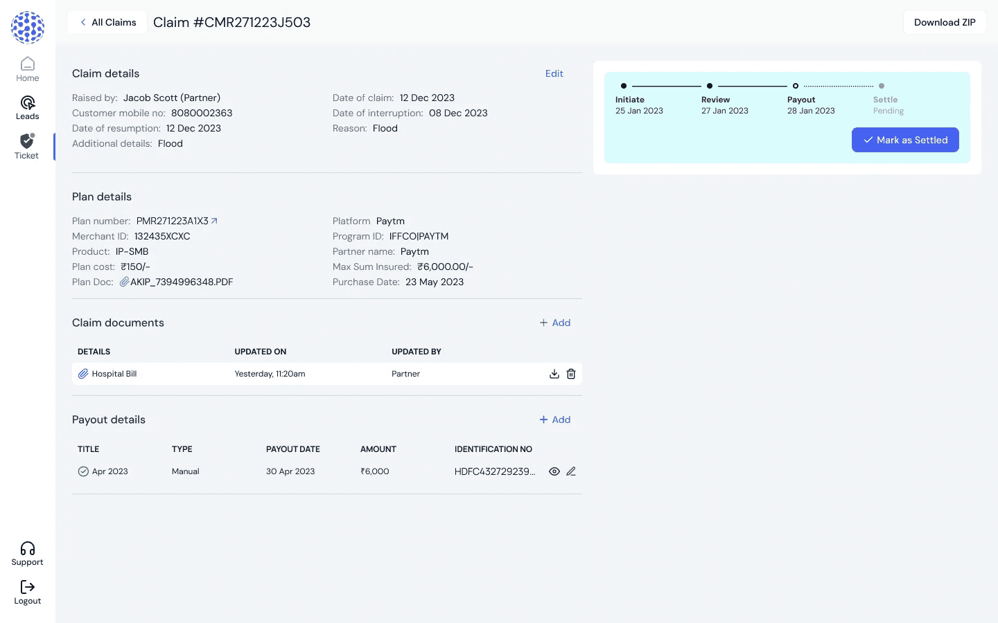
📷 The three problem areas: the dense layout, the detached status card, and the empty space where the activity log would go
What we took into the design.
The requirement was clear but the risk was real. Full directional freedom on status changes needed guardrails, otherwise one wrong click on a terminal state would create a bigger problem than the one we were solving.
Exploration & Iteration
Version 1 — Two panels
The first direction we explored was a two panel layout, main content on the left, claim status and history on the right, no sidebar, plan details still sitting inside the main column.
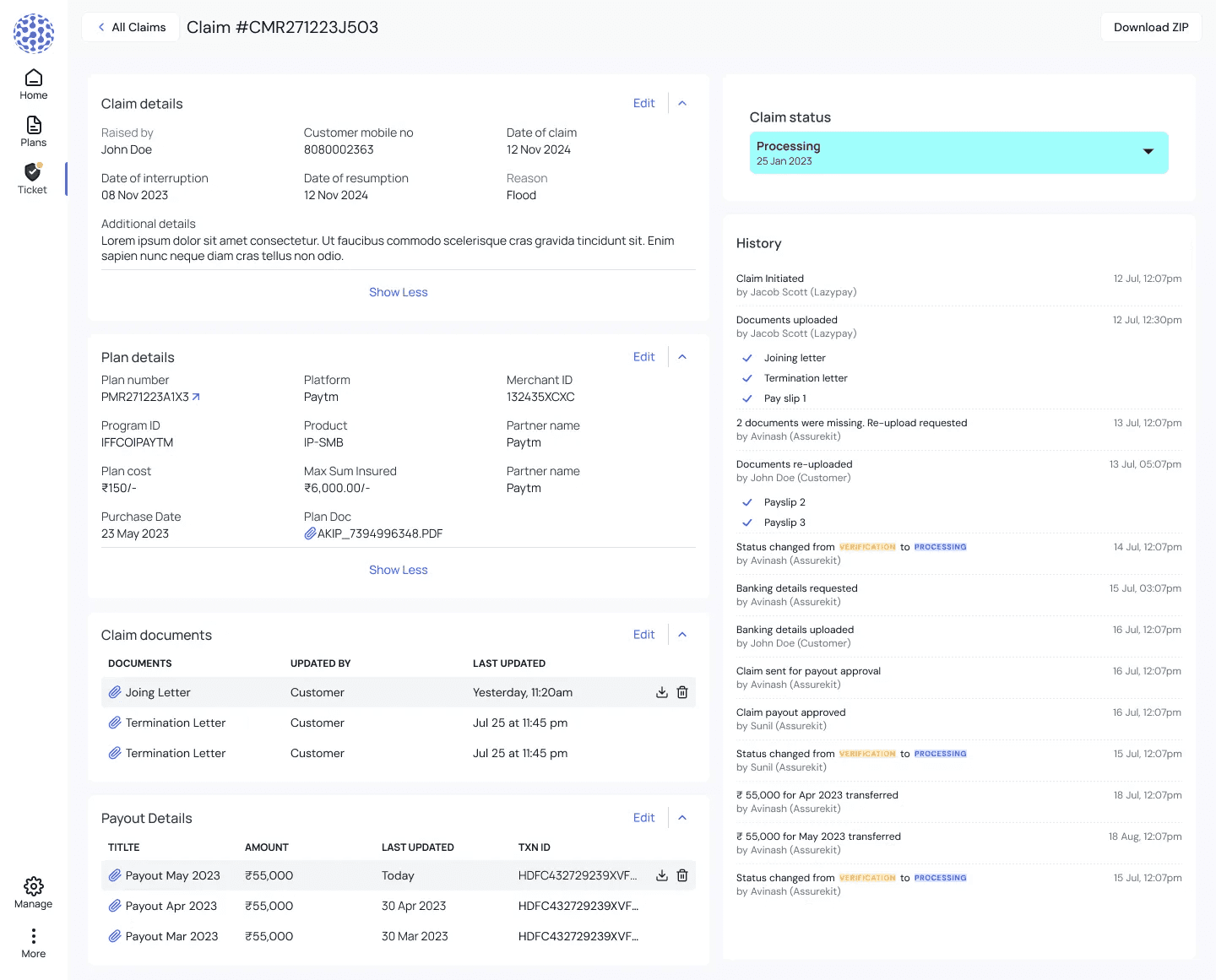
📷 Early two panel exploration frame
It broke down for three reasons.
The left side became too information heavy, claim details, plan details, documents, and payout all stacked in one scrollable column. We had recreated the density problem we were trying to solve.
There was no fixed home for contextual information. Plan details and partner information are things ops teams reference throughout a ticket. In a two panel layout, they would scroll away as soon as the user moved down the page. We needed them anchored somewhere permanent.
The layout had to scale. The same structure would be used for cancellation and plan management sections, which had their own content requirements. A two panel layout was too rigid to hold up across all three.
That is what pushed us to three panels.
Refining the Activity Section
The activity section also went through visual refinement from this stage. The exploration version had a flat history log, plain text entries, no visual distinction between a status change and a document upload, no way to tell at a glance who did what. The final design addressed all of that.
Design Decision
The redesigned claim ticket brings everything ops teams need to manage a claim into one screen. The three panel layout keeps context, content, and communication visually separated so nothing competes for attention.
The Left Sidebar — Permanent Context
Moving plan details, partner name, logo, reference ID, and program ID into a fixed left sidebar was one of the first decisions we made after the exploration. In the two panel version this information sat inside the main column and scrolled away. Ops teams handle claims across multiple partners and plan types, losing that context mid-ticket was a real problem. The sidebar keeps it visible at all times.
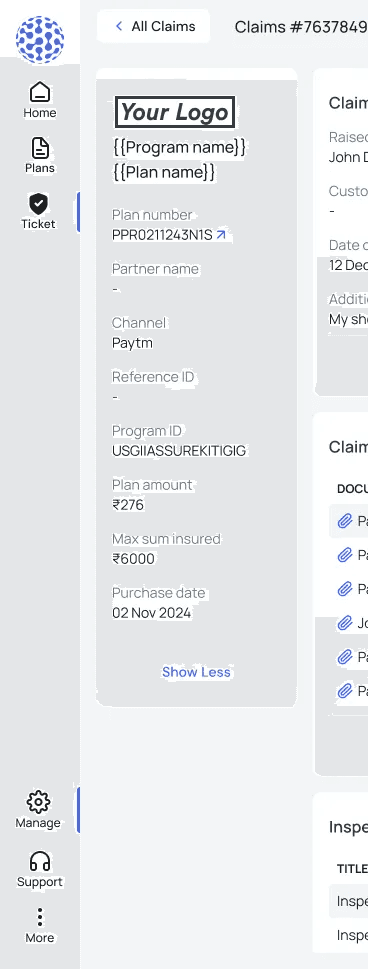
📷 Left sidebar of the after screen
The Main Column — The Working Area
Claim details, documents, and payout sit here. Sections are collapsible so ops teams can focus on what is relevant without scrolling through everything on every ticket. The three column grid for claim details gives each field space to breathe, a direct response to the density problem in the old design.
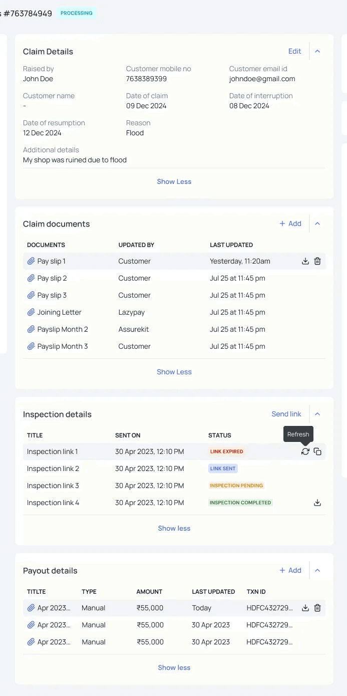
📷 Main column showing claim details in grid layout and collapsed sections
Inspection Details on the Ticket
The ops team previously had to go to a third party vendor's platform to check where an inspection stood. The redesign brought that visibility into the ticket. Ops teams can now see inspection link status, sent, expired, pending, completed, directly on the claim without switching tools. The vendor still handles the inspection itself, but the tracking now lives here.
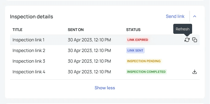
📷 Inspection details section showing different link statuses
Non-Linear Status Management
The status system moved from a forward-only stepper to a dropdown. Ops teams can move a claim to any stage in any direction. Rejected and Settled are the only terminal states, once you reach them you cannot leave. Every status change, regardless of direction, triggers a confirmation step before it goes through. This was not in the requirements, it was a design call. Ops teams move fast, and one misclick on a terminal state would be harder to fix than the original problem.
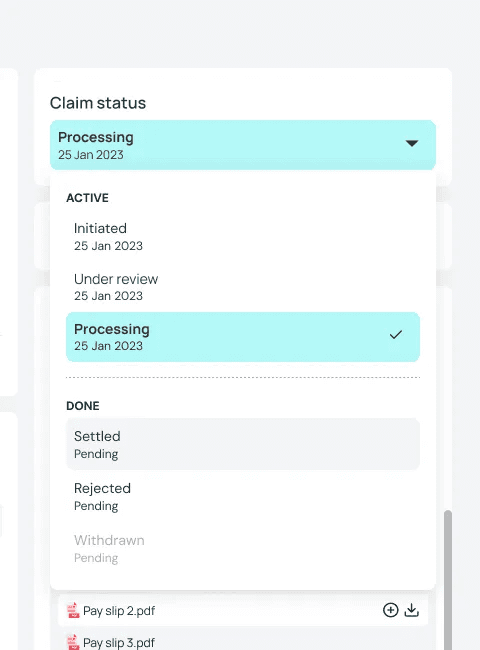
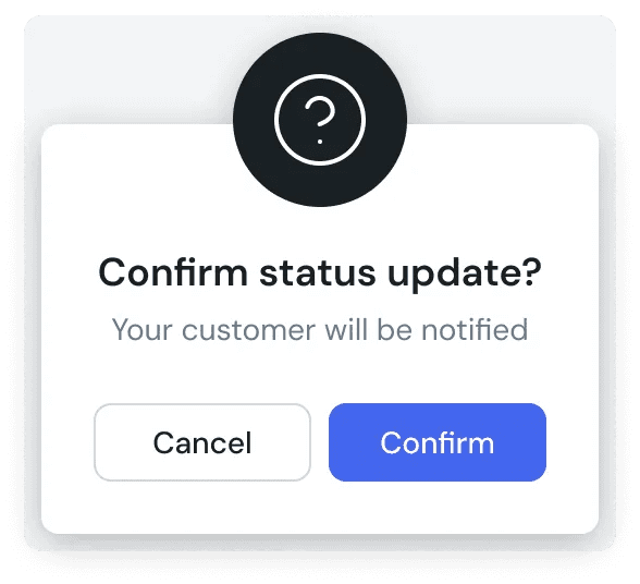
📷 Status dropdown open showing all options and the confirmation dialoge
Activity Log Native to the Ticket
Status changes show colored badges, INITIATED, UNDER REVIEW, PROCESSING, so the lifecycle of a claim is scannable without reading every line. Avatar initials show who made each change. Comments have a card treatment that visually separates them from system events. Time groupings, Yesterday, Today, orient the reader in the timeline. A comment input with file attachment sits at the bottom so internal communication happens on the ticket, not outside it.
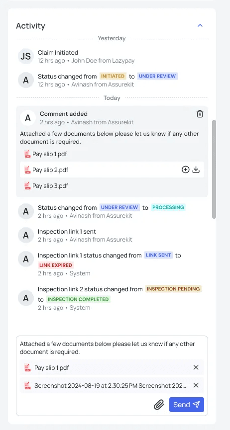
📷 Activity log showing status badges, avatar initials, a comment card with attachment, and the comment input at the bottom
Confirmation Dialogs for Irreversible Actions
For Rejected and Settled, the confirmation dialog makes it explicit that this action cannot be undone. This gives ops teams the speed they need for routine changes while slowing them down just enough on the ones that matter.
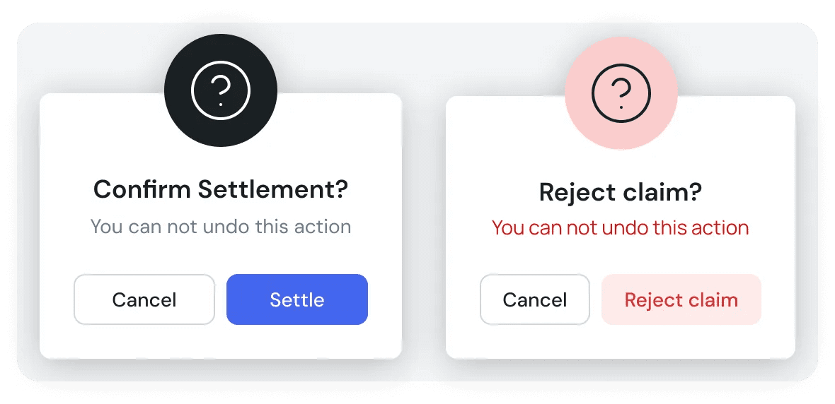
📷 Confirmation dialog for a terminal status change
Validation
We walked a few members of the ops team through the redesign before it went live. The session was straightforward, no major concerns came back. The cleaner layout landed well, and the activity log was specifically called out as something they had been missing. Having the full history of a claim visible on the ticket, without having to go outside the platform, was the part that resonated most.
We also reviewed the design with the development team. The old layout had no clear grid structure, which made it harder to build consistently. The new three panel layout works on a 12 column grid, so the handoff was smoother and the developers had a clear structure to work with. No concerns were raised from their side either.
Final Flow
A few screens from the final design, the redesigned claim ticket in practice.
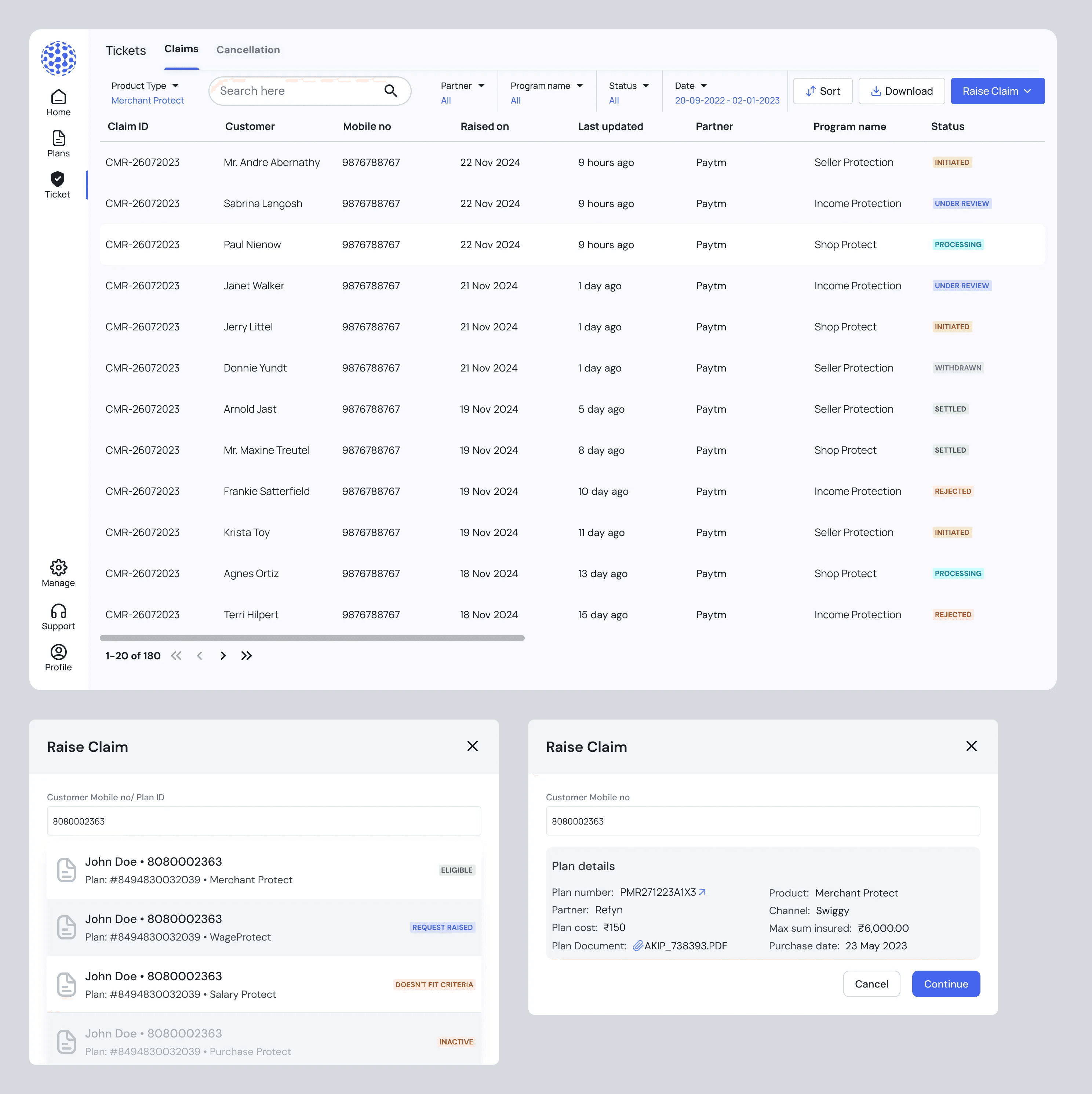
📸 Claims list page.
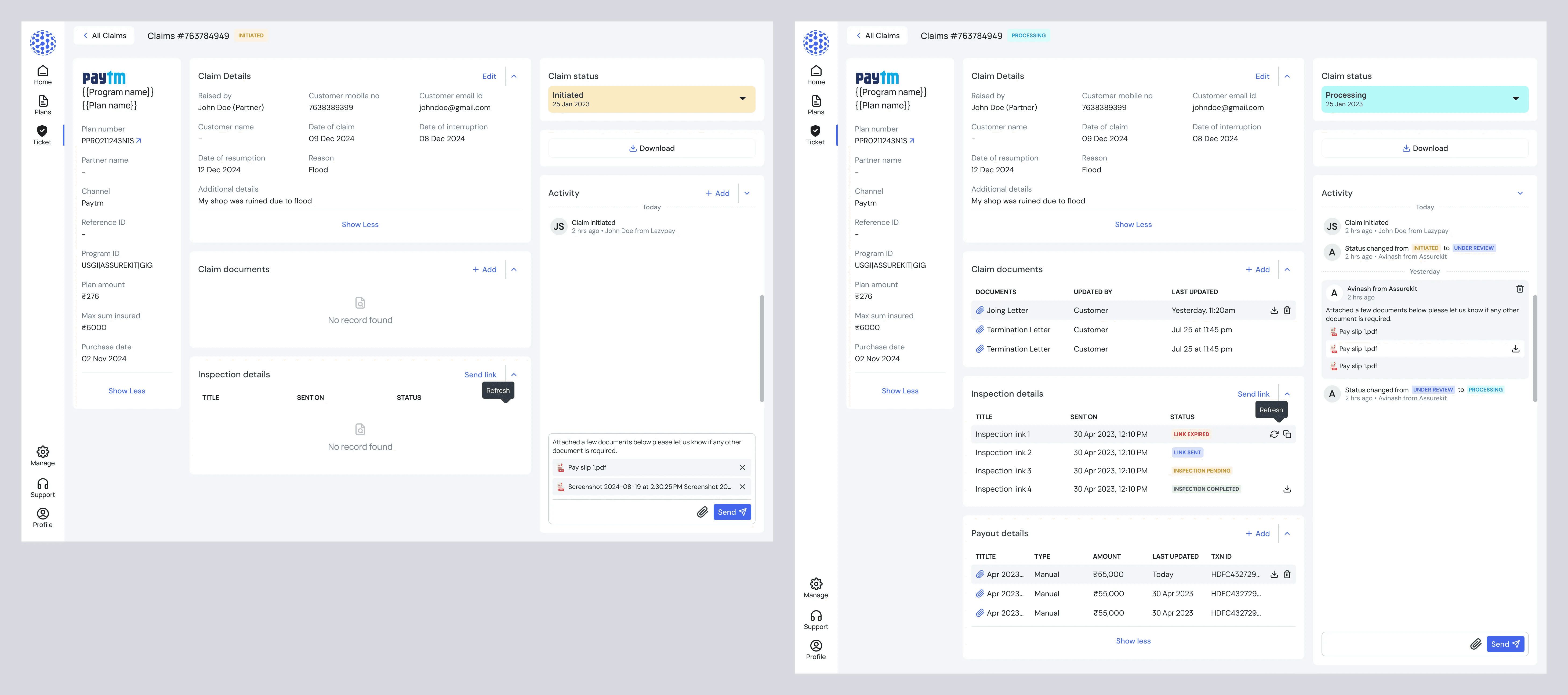
📸 Full claim ticket — three panel layout.
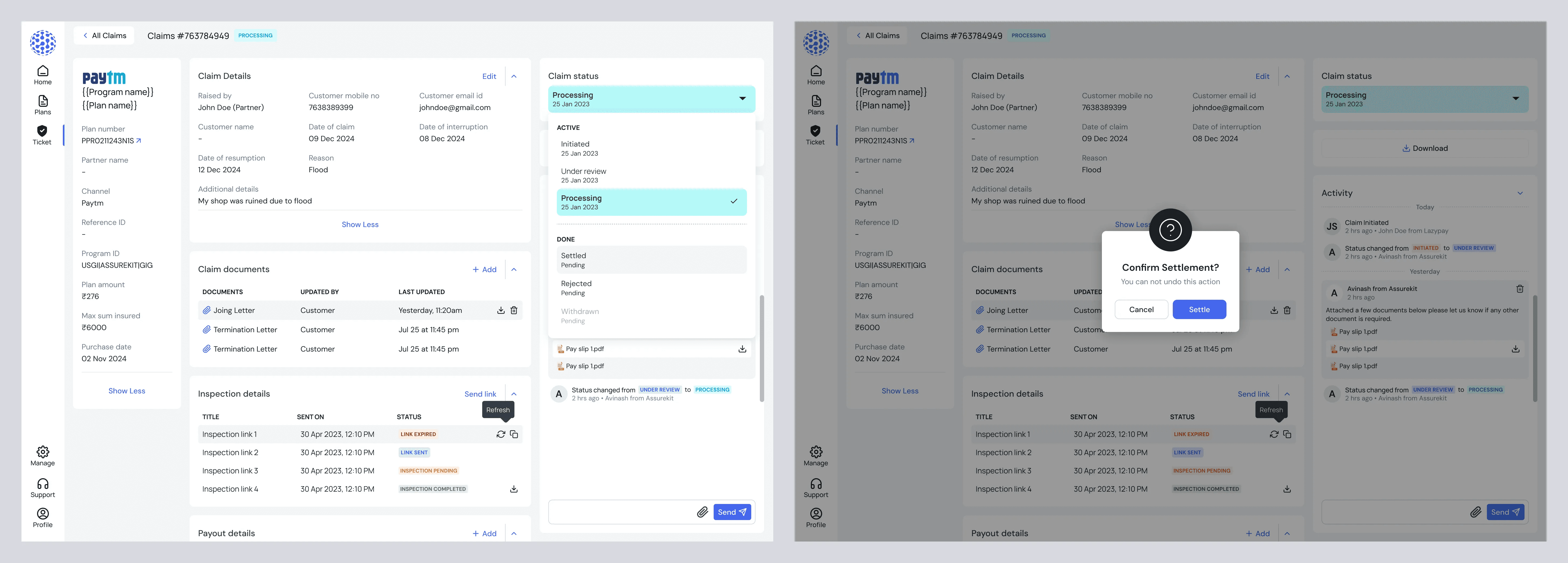
📸 Status dropdown and confirmation dialog.
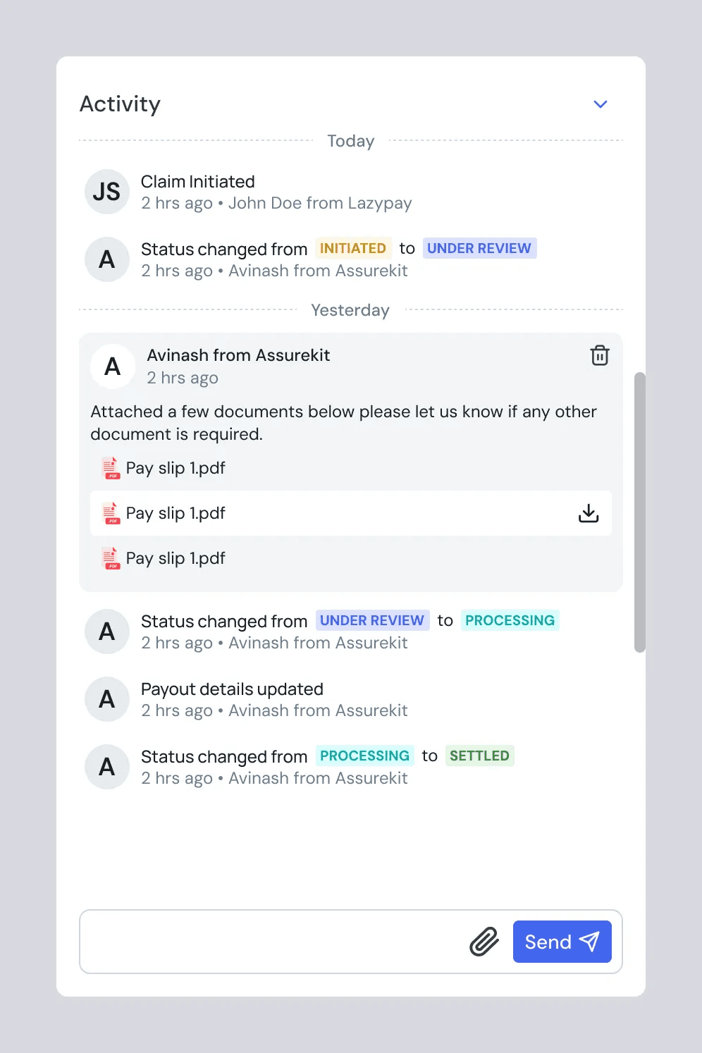
📸 Activity log with status badges, comment and system events.
Outcome
Faster launches, less engineering load. Before, every new program required a developer. After, Ops handled it directly, removing roughly 45 minutes of engineering time per program and the scheduling dependency that was quietly slowing every launch down. At scale, that compounds fast.
Fewer errors, lower risk. Configuration mistakes in this domain aren't just annoying, certain fields can't be changed once policies are sold. Structured inputs and clear required fields reduced the ambiguity that caused those mistakes.
Ops could scale without pulling in engineering. As partner volume grew, engineering involvement didn't have to grow with it. Programs were structured consistently, launched independently, and tracked clearly.
A clearer sense of ownership. The Ops team went from submitting requests and waiting, to running the process themselves. Accountability became clearer because control became clearer. The guardrails were built into the tool, so autonomy didn't come at the cost of correctness.
Reflection
This was a redesign, not a zero to one project, which means the starting point was not a blank canvas. It was a screen that real people were using every day with real workarounds built around its limitations. That framing changed how I approached the problem, the goal was not to reimagine the claims ticket from scratch but to understand what was actually broken and fix it without disrupting what was already working.
The most interesting decision in this project was the status flow. On the surface it looks like a small interaction change, a dropdown instead of a stepper. But the thinking behind it took some time to get right. The requirement was clear but the risk was real, giving ops teams full freedom to move statuses in any direction without any guardrails would have created a different problem. The confirmation dialog was the answer to that, and it was a call I made without being asked to. That felt like the right kind of design thinking, not just executing a requirement but thinking through what could go wrong if you did.
The activity log was the addition I am most happy with. It was not in the original brief, but it came out of understanding how the ops team was actually working. They were tracking claim history through conversations outside the platform. Bringing that into the ticket felt obvious once we saw it, but it took listening to how they worked to get there.
If I could go back, I would push for a more structured feedback session with the ops team after launch. The walkthrough went well, but a proper review a few weeks into using the new design would have given us more specific feedback on what was working and what was not.
The component decisions here also carried into the cancellation and plan management sections. That was intentional from the start, but it reinforced something I already believed, decisions made early in a redesign travel further than you think.